Creating a ”Start-up Neighborhood” with Interior Design
GEEKS AKIHABARA

Scroll Down

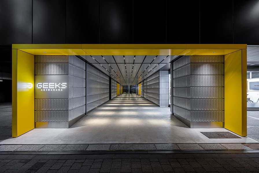
In the post-World War II-era , Tokyo’s Akihabara area developed into the largest electronics district in Japan. In the 21st century, it gained worldwide renown as a mecca for anime, video game, and “idol” subcultures. GEEKS AKIHABARA is a value-upgrade project for a medium-scale tenant office building initiated on the client's desire to attract up-and-coming IT companies and start-ups and to create a new business and cultural trend. Departing from a large-scale reconstruction or architectural renovation, Nikken Space Design (NSD)(at the time of the interview, currently Space Design Group, Architectural Design Department, Nikken Sekkei; merged with Nikken Sekkei on April 1, 2024) proposed to renew the building through the power of design, aiming to make it a local icon.

CATEGORY

A ”launch pad” for the bold

The property, a tenant office building completed more than 20 years prior, is located about a minute's walk from Akihabara Station. Pre-renovation, the facade was comprised of a typical natural granite. Although somewhat luxurious, the property was hard to differentiate from the surrounding buildings. The NSD design team held numerous discussions on how to resolve issues such as age-related deterioration, the lack of unique offerings, how to increase asset value, and how to entice start-ups to become tenants.

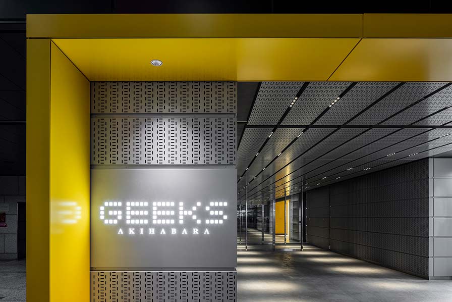
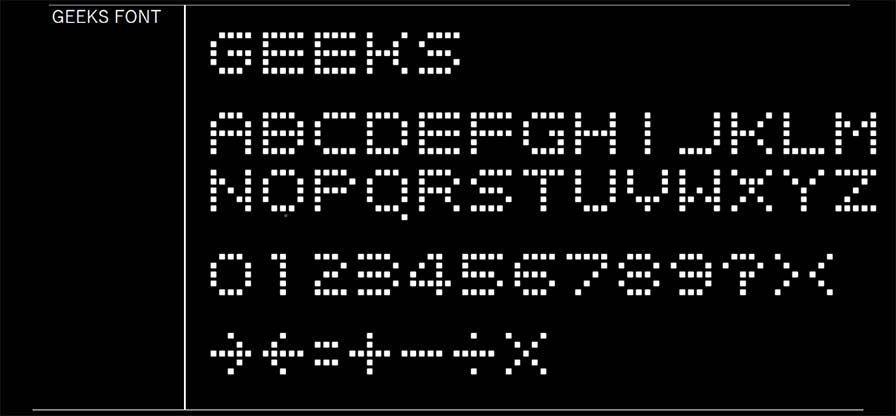
A key project focus lay in defining up-and-coming start-ups as main target tenants. Branding ideas for the building took top priority, based on the notion of creating a platform for companies that would make great future strides. We voluntarily proposed the building name and logo, settling on "GEEKS”, derived from "experts with outstanding knowledge," or "enthusiastic”. We also created and provided an original font for the logo.

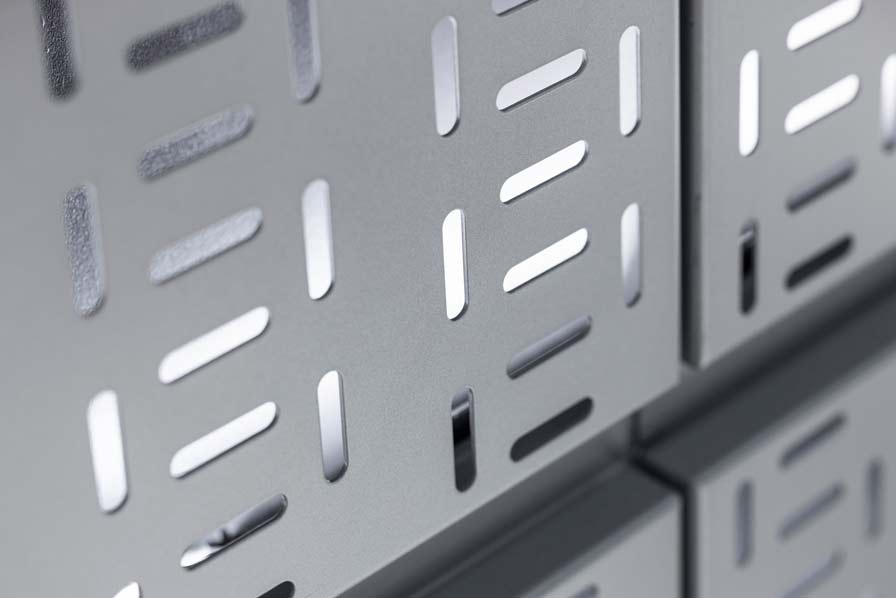
We wanted to express some element in the building’s design for its branding. We eventually settled on a 5x5 pixel dot pattern, the smallest used in early computer games and text, to incorporate the digital culture that continued to flow through Akihabara into the logo design. We first designed the "GEEKS" logo, and then used the same structure to expand to other alphabetic letters, numbers, and symbols.

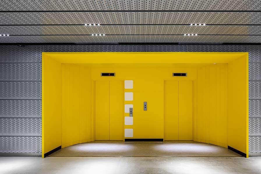
Use of this newly created font in the exterior and interior signage creates a sense of design unity throughout the building. Although the font itself is simple, it also allows for graphic expression as a focal point, such as in the elevator hall floor number signage.

The main renovation areas included the facade, entrance, typical floor common spaces, and the rooftop. Three design keywords were derived to express Akihabara’s unique vitality and to stimulate the creativity of new business challenge-seekers there. A project to remake a unique office building was based on these keywords.

Design Keyword 1: “Vitality”
Visualize the vitality of the city and the people working in the building

If one color could be selected to describe chaotic, trendy Akihabara, what would it be? After brainstorming, bright yellow was chosen as the building's theme color. Instead of painting the exterior walls, yellow blinds were lowered on all of the glass windows that make up the majority of the facade on the side facing the main street. This was an idea only an interior designer could have thought up; it also serves to visualize the vitality of the building's workers from the inside out. At night, the blinds are illuminated to make them stand out as if they are luminous, in the hope that passersby will be inspired to regain their vitality for tomorrow. The improved visibility has led to an increase in inquiries, and leasing is going well, according to the client.

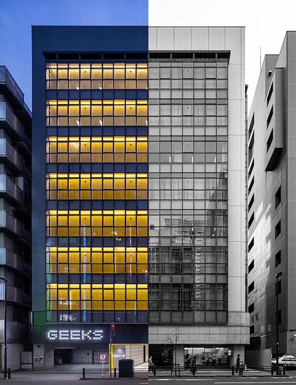
Building exterior, before and after renovation

Yellow is used extensively in common areas such as the elevator halls in order to convey inspiration, excitement, and amplified energy. The color scheme is a bold departure from more neutral-colored office buildings, which try to accommodate a variety of corporate tenants. But GEEKS tenants appreciate it as an expression of a young firm’s vitality.

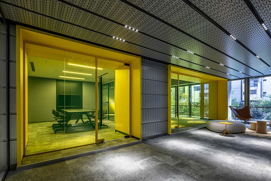
A readily-furnished office

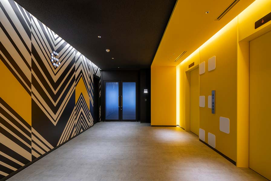
The building’s brand was enhanced with originally-designed fonts

Design Keyword 2: “Unfinished”
Daring to create without elaborating

Cable ladders for equipment wiring were used as finishing materials for the ceiling and walls of the first-floor entrance, corridor, and elevator hall. This metallic material is usually hidden in the ceiling and is not used for finishing. Indirect lighting through perforations in the cable ladders creates mysterious shadows on the floor. The tunnel-like futuristic passageway is designed to draw people into the building.

Cable ladders used for the finish.
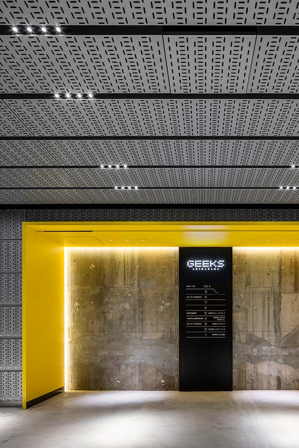
Light and shadows cast by indirect lighting using perforated openings create a futuristic-looking space

Part of the elevator hall wall reveals the existing building structure in its bare form. The granite finish was taken out of the floor to expose concrete. With the "unfinished" theme in mind, the design was intentionally left to appear rough in order to express a youthful dynamism, the raw ‘diamonds’ of business, growth potential, and blank space. The design, unbound by orthodoxy or stereotype, is intended to inspire start-ups’ creativity.

Design Keyword 3: “Intersection/Interplay”
Creating spaces that induce encounters and connections

On the rooftop, where people rarely frequent, we created a multi-purpose shared space called “10+” (“Ten Plus”). We hoped that it would be a place to accelerate creative activities. Furniture of various colors, materials, heights, and shapes are randomly arranged -- somewhat like the Akihabara streetscape -- leaving room for experimentation to trigger encounters and connections beyond tenants’ normal realm of interaction. Rooftop communications may lead to unexpected innovations.

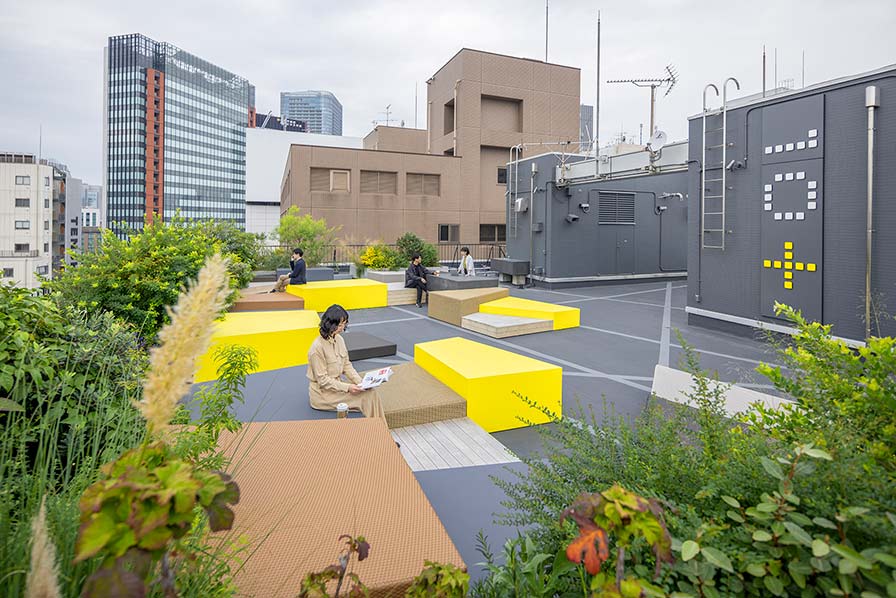
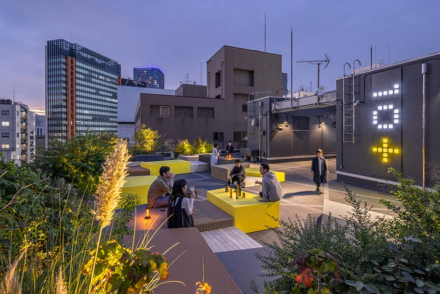
Rooftop: “10+” (“Ten Plus”), a place for tenant companies to interact

Someday, "GEEKS graduate" will be a status symbol

The project garnered high praise from the client, who said, "The design, based on the characteristics of the town, and tenant targeting, increased building asset value beyond expectations.” After companies that started here have ‘left the nest’, the next generation of start-ups will begin here, dreaming of tomorrow's success....

This project was an opportunity to co-create with the client a future where being a ‘GEEKS graduate’ will be a status symbol, and about which people will say, "I used to work in that yellow building...”

We will continue to work with our clients to realize not only the ‘centripetal force’ of a facility’s interior design, but also the power of brand communication to spread throughout the city.

Photography: Kenji Masunaga

  • Shinya Suzuki

    Shinya Suzuki

    Associate
    Space Design Group
    Architectural Design Department

    Mr. Suzuki has been involved in the design of numerous high-volume spaces, such as the common areas of large-scale facilities and retail venues, and has executed projects both in Japan and overseas. As a key interior designer, he is responsible for providing continuous service, from the initial planning stages to interior work completion, in all of his assignments. His portfolio includes Sumitomo Mitsui Banking Corporation Head Office Building (2010), Tokyo Skytree ® (2012), LOTTE WORLD TOWER SEOUL SKY (2017), HIMEDIC TOKYO NIHONBASHI, MIDTOWN CLINIC TOKYO NIHONBASHI (2020), and Haneda Airport Garden (2020). Several of his projects have been recognized for national and international awards.

  • Daisuke Tanaka

    Daisuke Tanaka

    Associate
    Space Design Group
    Architectural Design Department

    Mr. Tanaka joined Nikken Space Design in 2017. He graduated from the University of the Arts London with a Bachelor of Arts degree in Interior Design Management. After returning to Japan, he worked for a foreign design firm and was involved in the interior designs of many foreign-affiliated offices in Japan. In his prior position, he served as in-house designer for a major U.S. firm as Asia Design Manager, and has accumulated extensive experience in overseas projects.

  • Jingwen Zhou

    Jingwen Zhou

    Designer
    Space Design Group
    Architectural Design Department

    Ms. Zhou came to Japan in 2014 after finishing studies at East China University of Science and Technology in Shanghai. She went on to attend Chiba University’s graduate school, joining Nikken Space Design in 2018. She works on a variety of projects, including both hospitality and workplace projects. She continues to challenge herself, utilizing her foreign nationality as a strength in creating new values for space.

This website uses cookies. By continuing to use this website, you agree to the use of cookies. Our cookie policy.